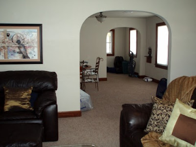
Because I'm always so inspired by other people's before and after's, I thought I would share some of our's. Since we're in a rental, we haven't done any major changes-painting, building or tearing down anything. Our design facelifts are mostly done with a few new furniture pieces and accessories. But if you ask me, there's still a world of a difference. Today, I'll share with you the transformation of the living room.
Before: When Jon first moved into this place over a year and a half ago, it looked pretty sparse with just his furniture. Luckily when I moved in a few months ago, that all changed. We have a pretty long living room with a huge opening on the wall leading into the dining room so the original furniture placement created a very undesirable empty space in the back of the room.

After: Enter my couch from Dallas. This couch has been in my family for nearly 20 years and still feels like new. The cushions have just as much volume to them as the day we got them thanks to La-Z-Boy and their cushion spring technology. While the couch construction was good as new, the fabric pattern was way out of date. The solution was an $80 2-piece slipcover from JC Penney. Goodbye wasted space; hello more seating.
Before: We decided to get rid of Jon's bulky leather couch and chair that he'd had since he graduated college.
The woven chest was used for storage in the bathroom of my old apartment. But now with a wooden tray on top, it functions great as a side table. Two new $15 frames from Kohl's and a sconce from my old place give the blank wall a little interest. Remington's cage was definitely not a part of the design plan, but the guy has to have a place somewhere, right?
Before: We decided to get rid of Jon's bulky leather couch and chair that he'd had since he graduated college.
After: We updated the space with a lighter color chaise couch we purchased in Dallas right before I moved up here. The new couch has sleek lines and a much more contemporary look.
Before: The old view from the living room into the nearly empty dining room.
After: Now, with the new furniture and accessories. Slightly different don't you think?
Before: Jon had his TV angled in the corner (a pet peeve of mine). So when I moved in in May, it got moved :)
After: Now the TV is centered on the wall with my bookshelf and new frames replacing its old spot. The curtains came with the house and actually ended up being a perfect match to our color scheme. All we did was update them with a new rod. The rug, bookcase and ottoman were all things in my old place that found new home here. Once again, excuse Remington's bed :)


Before: The matching leather chair and 80's side table also had to go. The chair was too large for the space and only offered seating for one person and the side table-well, do I really have to explain?
After: We updated the space with chairs from the living room of my apartment anchored on either side of my old side table (a $10 thrift store find that I refinished and have had since my apartment in college). The mirror was in my old bedroom but now helps to give the illusion that the room is much wider, which helps balance out its long length. All of the accessories you see were already owned or were given to us as wedding gifts (i.e. the silver dish on the ottoman, teal pitcher and silver clock on the side table). Due to the new furniture arrangement of the side table and TV, we now have extra artwork we need to find a place for.
Before: When you walked into the home, you saw really dark, solid furniture contrasting with really light walls.
After: Now there is a neutral color scheme and a mixture of textures, patterns and colors to give life to the space. The matching 80's coffee table also got replaced with a leather storage ottoman I owned.
Before: The space was bland, dark and empty.
After: The space is cozy and full of life.
What do you think?
P.S. Please don't hesitate to ask if you're wondering where we got all any of our purchases.


That old coffee table is hideous. Simply no other word for it.
ReplyDeleteLooks amazing Mal! You are a decorating/design wizard.